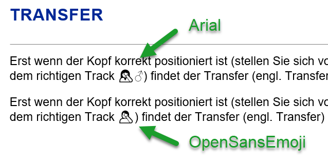
It is a font made of three other fonts, providing all most of the emojis you need.
This is basically a mashup font which consists of three fonts. The aim of OpenSansEmoji is to include the whole iOS (currently 6.1) Emoji set while keeping the file size as low as possible. Most of the symbols listed on the “Emoji” Wikipedia page are supported. All symbols are in monochrome.
Also, it is licensed under Apache 2.0 and therefore free to use.
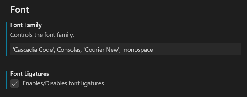
While I have written about my thoughts about montype fonts some time ago, I was still looking for some nice font to be used within Visual Studio Code as well as Terminal (macOS as well as Windows Terminal). Said that, Microsoft just released a new font (actually they open-sourced it). called Cascadia Font at GitHub.
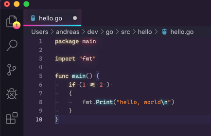
Once installed you still have to enable it in Visual Studio Code as written by Kayla Cinnamon.
And yes, it works like a charm once enabled.
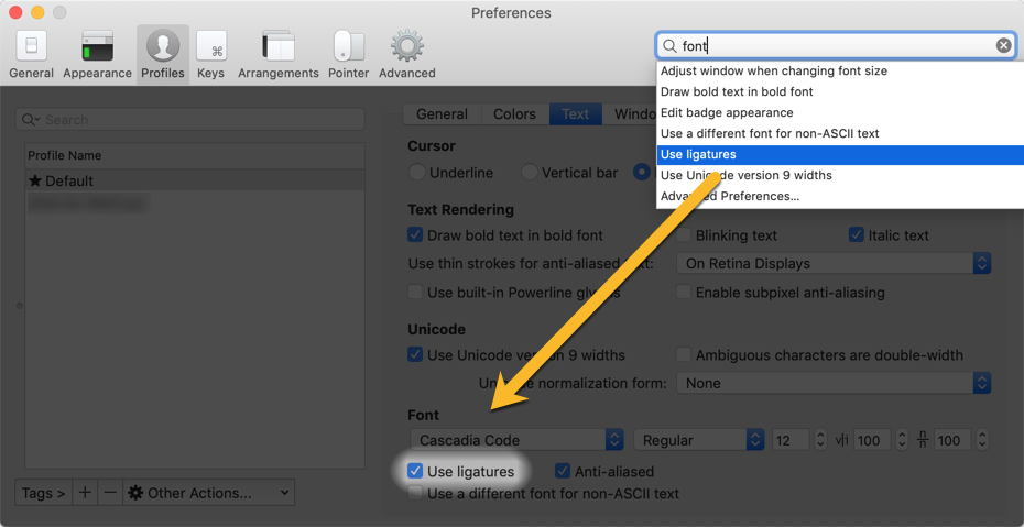
Besides this, I am using iTerm2 on macOS, and it is also possible to enable this font including font ligatures for your Terminal sessions.
Since it was introduced in 2005, Consolas was my favourite monospaced font for development environments. More or less by an accident, I came along an article introducing Inconsolata by Raph Levien, which is a font inspired by Consolas.
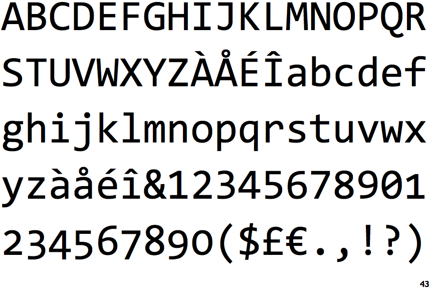
Inconsolata by Ralph Levien
While it is hard for me to tell the difference out of the box, you can see quite some differences when both fonts are compared to each other.
Consolas
The differenced are subtle, the letters are tighter and look at the same time more fresh to me. Some major differences you can see at the ‘A’ or more obvious at the pound sign. Especially these differences drove me to try this font out. I started to change the font in my favorite editor, Visual Studio Code as I use it day by day.
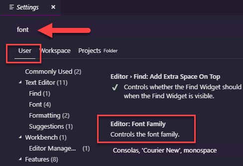
To do so, you simply open Preferences / Settings and look up for font in the User section of the settings.
Changing Fonts in Visual Studio Code
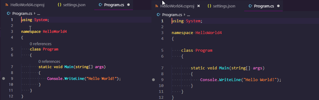
While I really like the font, it turned out that code and especially text files are much harder to read for me. You might see the differences in a side by side comparison when clicking on the image below.
Side by Side Incosolata (left) and Consolas (right)
On the left side, the text seems more squashed while Consolas on the right side appears more readable to me. In this case, both examples use a default font size of 14. The problem is, I liked the left side much more the way it looks but can work much better with the appearance on the right side.
I might stick with Consolas for quite some time, while I am looking for an alternative to use.