Tufte Style LaTeX

You might have heard of Edward Tufte. As a pioneer in data visualization, he also spent quite some time in book designs.

There is a great LaTeX project on GitHub dealing with this special design of Tufte’s books.

Example Book from tufte-latex

If you are just new to LaTeX or simply did not used it for a long time with it like me, this getting started tutorial will help you to get everything in place.

GitHub project: https://github.com/Tufte-LaTeX/tufte-latex
GitHub pages: https://tufte-latex.github.io/tufte-latex/
Getting started with Tufte-LaTeX: https://ajtulloch.github.io/2012/getting-started-with-tufte-latex/

Can’t Unsee – A Game about the Visual Details

In my recent lectures about interactive systems, I talked a lot about standards and guidelines for visual design. When I learned about Can’t Unsee,I had to share this with my students at once. It is a little game where you can learn quite a lot about the details of visual design.

It shows you two alternatives of designs differing only in a few or even one detail. The further your get, the harder the challenge becomes. While the differences are obvious in the beginning the details are getting harder to realize by time.

Can't Unsee Website

I can y recommend to play this little game, if yo want  increase your sensibility to the little details of visual design.

Link: https://cantunsee.space/

High Quality Icons – The Noun Project

I always loved to enhance my presentations and lecture slides with visual content. At Microsoft, we used to have a Ressource DVD with hundreds of box-shots and icons to be used for marketing and other occasions. Meanwhile, I prepare a lot of educational lecture slides. However, universities usually do not provide such resources. Even most of the companies I’ve worked for did not provide a lot of these materials.

Eventually, I learned about the Noun Project where you can get thousands of high-quality icons for an absolutely fair price.

The project does provide various applications for Mac, iPhone as well as add-ons for Microsoft Word and PowerPoint. I just started to use the PowerPoint add-on being highly pleased by its functionality. You can search for icons, select from various resolutions and choose an appropriate color. Considering the time I spend to create, search for and adapt icons the price of 40 € is quite fair.

Noun Project PowerPoint Add-On

tl;dr

If you are looking for a high quality and easy to use collection of icons, you should have a look at the Noun Project.

Link: https://thenounproject.com/

Pixeur Color Picker

For quite a time, Pixeur became one of the tools I almost can’t work without anymore. It is a lightweight and free color picker provided by Veign.

First of all, it’s easy to pick a color from the standard color palette. A great feature is the automated calculation of HSB, RGB and CMYK and Hex (the numbers used in HTML code) values. Which value you ever need, Pixeur does calculate the corresponding color codes. 

Pixeur Color Picker 

The ultimate uber feature is the screen picker tool. You simply drag and drop the pointer to the pixel on your screen you want to know the color code from.

Screen Color Picker

Drag and drop the target icon to whatever pixel on your screen to get the exact color value. In addition a zoomed area of the hovered are is shown in the corner of your screen which makes it quite easy to pin down a single pixel even on some kind of retina like displays.

Picking a single pixel with Pixeur

It’s very simple to use and so far I haven’t had any issues with the tool. Amazingly, the tool worked since ever on various Windows versions I used so far including Vista and windows 7 without the need of updating.

Pro:

  • easy to use
  • low footprint (~2MB)
  • provides color values in various formats
  • screen wide color picker
  • zoom of the hovered area when picking a color
  • free (i.e. no money, cash, PayPal or diamonds needed)

Contra:

  • Hard to find on the web

The tool is so great, I usually forget about it until I need to get a color code or pick some pixel’s color from the screen. It’s one of the first tools I install after setting up a new machine, and there’s the problem – if you don’t know where to find it, it’s hell of a job to find the download site.

There are probably a dozen of similar tools out in the wild, and each and every major drawing program probably provides such features. However, as a free, and very easy to use alternative, give it a try.

Processing a Larger Pair

Yesterday, I had my first poker round for a very long time with two good friends of mine. A couple of years ago, we started playing Texas Hold’em – as computer scientists, of course just because of the maths and statistics.

Four of a KindDuring yesterdays game, we had a great hand facing a pocket pair of sevens a pocket pair of aces. By the flop and turn two more sevens came up providing me four of a kind and eventually the pot. Afterwards we had a nice chat about when and how to play a pocket pair as with three or less players on the table, one would play a pocket pair to the very end most of the times. However, with yesterdays hand in mind, I was quite interested in the statistics and the probability, my opponent might have a larger pair than 77.

I thought of this being a nice exercise for today visualizing this using Processing. As for any visualization, I needed some data. Therefore, I picked the corresponding table of probabilities from the Poker probability page on Wikipedia.

The visualization itself is straight forward, drawing he probabilities, axis and finally the labels. I decided to draw the axis after he probability curves simply to keep them on top of any other element on the canvas.

void draw()
{
    for(int col = 1; col < colCount; col++) {
      drawProbability(col);
    }
    drawAxis();
    drawLabels();
}

Finally, the result looks like the following. Indeed, you can see, that within a game of three people, there is only a 12% chance that someone would get a larger pair even if you hold a pocket pair of twos.

Processing chart for Poker Probabilities holding a Pair

Of course, you could create such a chart using Microsoft Excel and there is no rocket science in this visualization. However, this was quite a nice exercise to re-activate my Processing skills. Positioning of labels is done relative to the size of the canvas and the length of the text as well as the color chosen for the number of opponents is chosen dynamically. The whole example is available at http//aheil.codeplex.com.

A Simple Vedea Example

Vedea
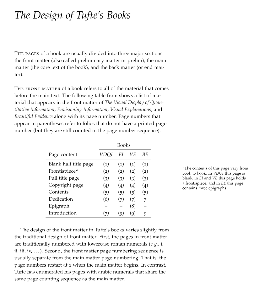
My colleague at Microsoft Research in Cambridge, Martin Calsyn recently unveiled the second project we are working on at the Computational Science Laboratory at Microsoft Research in Cambridge, UK. The Microsoft Visualization Language codenamed Vedea is an experimental language for creating interactive infographics and data visualizations. The language initially targets non-programmers, however, Vedea also provides sophisticated features such as LINQ for experienced developers as Martin demonstrates in his post.

Vedea was demoed the first time at PDC09 to the public. The demo shown there visualizes global IP traffic monitored during a 24h time span. The data is organized in a standard CSV file and contains source, destination, geographical coordinates, IP numbers and the time and some more statistical information.

Example Source Data

The data itself is rather unspectacular and the most useful for some statistical analysis. However, with Vedea is is relatively easy to visualize the data in a handsome manner. Before you go on, please be aware that the language is still under development and the given example just represents the state of development at the time of PDC09.

img = LoadImage("world.png");
Scene.Add(new Vedea.Image(img, 0, 0));

for (i=0; i<len; i=i+1) {
  b = Noise(i*255);
  Stroke(20, 0, 0, b);

  x1 = csv.SourceLon[i];
  y1 = cvs.SourceLat[i];
  x2 = cvs.DestLon[i];
  y2 = csv.DestLat[i];
  c = new Vedea.Curve(x1-10, y1-b, x1, y1, x2, y2, x2, y2-b);
  Scene.Add(c);
}

The fist two lines of code are used to load background image. after loading, the image is added to the current scene. The Scene object describes the standard canvas, the programmer draws on. This demonstrates the object oriented capabilities of Vedea. As Vedea is a dynamic language which is based on the DLR, there is no need to declare the type of the image object.

At the next lines we find a simple for-loop that iterates through all lines of the source data. The data file has been loaded similar to the image beforehand into an data file called csv and len is a value of roughly 100.000. So yes, we draw an manage about 100.000 primitives here. Most of the language features in Vedea can be used in a imperative or declarative way. Noise for example is a built-in language features that returns a random number (between 0.0 an 1.0) based on a one-dimensional Perlin noise function. This function is used to create a smooth color gradient with a alpha channel of 20 for our visualization.

Vedea Curve Stroke is used in a declarative way to set the stroke color for all primitives drawn afterwards. The next four lines simply read the x- and y-coordinates Finally, a curve is drawn and added to the current scene. The fist and the last point specified are control points that determine the curve’s flexure while the second and third point describe the actual start and endpoint of the curve. Of course the Curve primitive can be used in an imperative or declarative style (or both) as well:

Stroke(255, 0, 0);
Scene.Add(new Vedea.Curve(5, 26, 5, 26, 73, 24, 73, 61));
Stroke(0, 0, 0);
Curve(5, 26, 73, 24, 73, 61, 15, 65);
Stroke(255, 0, 0);
Curve(73, 24, 73, 61, 15, 65, 15, 65);

In the original example we use the previously generated random value b also to vary the curves control points corresponding with the color. Once we run (remember, we are based on the DLR and thus we don’t compile) the example, we finally get our visualization.

Vedea Vizualization

In his post Nick Eaton stated that

Users of Vedea obviously need to have some background in coding.

This is not necessarily true as the example above should show. Using the declarative style of the language it is relatively easy to create appealing visualizations with only little knowledge about programming structures and technologies such as DirectX, GDI+ or WPF. As seen in the example above its within the nature of Vedea to forgive various mistakes which makes it easy to use from the very beginning.

Vedea is a research project of the Computational Science Laboratory of Microsoft Research in Cambridge, UK. The project and still under development. The example shown here represents the state of the project at the time of PDC09 as it was presented to the public. As this is an ongoing project the language might evolve, new features will be developed and others might become obsolete.

Introducing Microsoft Computational Science Studio

One disadvantage working for Microsoft Research is that you cannot talk about your current work all the time. For two years now we were working on two exiting projects. However, there was not a lot to talk about since now…

The very first time we have shown Microsoft Computational Science Studio was at TechFest 2008 at that time codenamed ‘Discovery’. There we showed it to the public the first time to visualize, simulate and predict future development of global forest growth based on a novel scientific model developed by scientist Drew Purves.

At the Advanced Developers Conference Keynote in Bonn, Germany I already talked about the unique collaboration within the Computational Science Laboratory within Microsoft Research in Cambridge, UK. A unique setup of brilliant scientists from various fields and a group of great software engineers work together creating next-generation software solutions to address future challenges in computational science. The team includes Martin Calsyn (Architect), Alexander Brändle (Head of Technology), Drew Purves (Scientist), Matthew Smith (Post-Doctoral Researcher), Stephen Emmott (Head of Computational Science Laboratory within Microsoft Research and Professor of Computational Science at Oxford University), Vassily Lyutsarev (Manager Scientific Computing), Benjamin Schröter (Software Engineer), Eric Hellmich (Systems Engineer), Shawn Barrett (Quality Assurance and Software Engineer) and myself.

As part of his College Tour, Craig Mundie presented our work, the Microsoft Computational Science Studio (MSCSS), to the public at University of Washington, University of Illinois, Harvard University and Cornell University. Among he said about MSCSS:

Now, the way that this is actually built is it’s a bit like having Visual Studio, which is a toolkit for people writing programs — these guys call this the Science Studio, because the goal is to allow people not to write programs in the traditional sense but to compose large scale models together for scientific purposes.

Indeed, he showed the large scale model we worked no the weeks before with our scientists:

The whole talk at University of Washington is available as webcast from UWTV. Further articles are available from CNET, TechFlash and The Seattle Times where later says

A guy who is a climate scientist or a tree biologist can make a direct contribution without having to understand everything else or becoming a computer wizard in the process,” Mundie said. “I tell people this is sort of doing for scientists and policymakers what Excel did for the average business guy 20 years ago

Further posts on MSCSS and our second project called Vedea, being currently demoed at PDC09, will follow soon. Until then you might want to read an overview of MSCSS at Martin’s blog.

World Wind 1.4

Currently I have started a new project and I am looking into some geo-related projects. NASA World Wind 1.4 is now available. World wind makes massive usage of .NET and DirectX and runs quite smooth under windows Vista. The data is also provided by Microsoft Research TerraServer-USA, hosting aerial photography and topographic maps.

World Wind

World Wind

Unfortunately, TerraServer provides only United States Geologically Survey (USGGS) data. Better images for local European location can be accessed using the Virtual Earth plug-in, available from here. A video of Virtual Earth in World wind can be found here. Unfortunately, the plug-in does not seem to work with the latest World Wind version.

[Update 24/02/2007]

With the updated plug-in for version 1.4 available also the Virtual Earth data can be displayed.

World Wind Data